The Artist-First Hub to Support Collaboration, Promotion and Career Navigation
Role
Solo UX & UI Designer
Tools
Figma
Duration
January to April 2025
The Problem
The digital revolution has reshaped the music industry. Today’s landscape is defined by streaming platforms, social media, and algorithm-driven promotion.
While technology has democratized music distribution, it has also led to an oversaturated market, making it increasingly challenging for new talent to stand out.
Why This? Why Now?
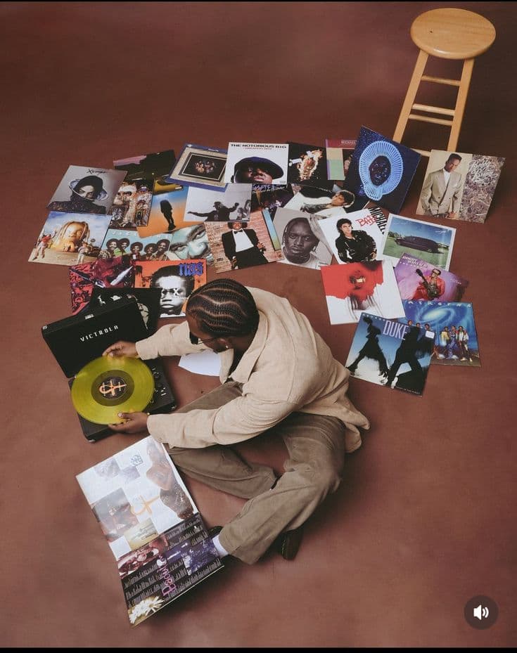
The motivation was inspired by a conversation with a close friend of mine who is an aspiring artist and struggling to get the likes and views he expects on his social content even after leveraging analytics tools on social media.
In 2024 alone, over 100,000 songs are uploaded to Spotify every day. Artists are expected to not only create music, but also become expert marketers, data analysts, and community managers.
With the rise of generative AI and content saturation, authentic discoverability is getting harder to achieve, making it a great moment to rethink how we can support emerging talent.

The Solution
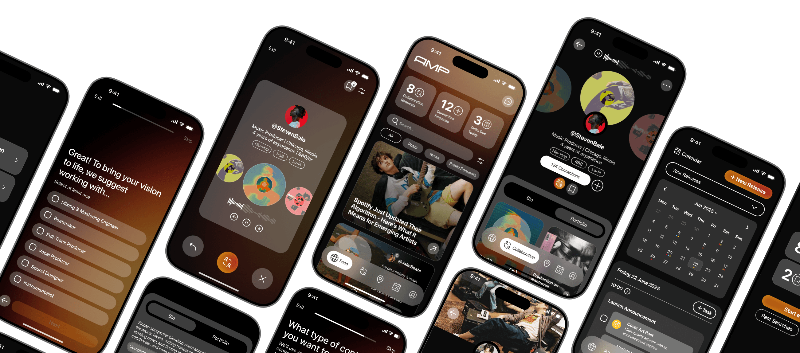
A networking and personal professional development app, helping emerging artists 1 meet collaborators, 2 manage their content and 3 discover opportunities.
Music-Focused Social Feed
A feed designed for artists featuring creative updates, collaboration requests, and behind-the-scenes posts from fellow musicians.
Personalized Industry News
Featured Performance Opportunities
Posting to Networks for Feedback from Creatives
Modular Widgets as Activity Notifications
Collaboration
After completing a personalization quiz, artists are matched with producers, engineers, and creatives who match their sound and project needs through a swipe-based interaction.
Curated and Quick Demo Discovery for Easy Evaluation
Music-First, Professional Profiles Built for Industry Networking, Not Fans
Promotion Planning
After completing a short quiz about their goals, release dates, and audience, artists receive a tailored promotional plan for social media.
Auto-Generated Promotion Calendar Reducing Planning Fatigue
Project-Based Organization Helping Manage Promotion Systematically
Smart Post Suggestion Based on Timing, Audience, and Patterns from Similar Artists
Phase 1 — Discovery
Secondary Research
70%
of musicians face challenges getting heard in a saturated space, where standing out feels increasingly out of reach.
88%
of new artists struggle to understand algorithms & build promotion strategies, making marketing a challenge.
62%
of artists find it difficult to grow and sustain audiences, limiting their reach and long-term career progression.
Primary Research
To better understand the behaviours, motivations, and pain points of emerging musicians, I conducted interviews with 4 artists at different stages of their creative journeys.
This included singer/songwriters and producers who were either actively releasing music or consistently collaborating with others. From affinity mapping, I found 4 key themes that I took forward with me into the next stages of the project.
Post-Release Promotion Is Exhausting and Unstructured
Motivation
“I need a consistent content strategy in order to get the songs the attention I think they deserve.”
Behaviour
“If there was someone else that could do it for me, I'd definitely just hand that off.”
Pain Point
“It takes a lot of time and effort to just keep it up.”
Avenues for Feedback & Growth Aren't Streamlined
Motivation
“Technical feedback, like mixing and mastering, is something almost every musician would want.”
Behaviour
“If I'm recording with my friend who's the producer … I'll usually ask him, ‘what do you think about this decision? I think I can deliver that better?’”
Pain Point
“The thing you think is the best from you might not be what other people think is the best from you.”
Financial Instability is a Major Stressor
Motivation
“That's why I want to get a job - so I can fund my music career and not have limitations on who I can work with or where.”
Behaviour
“I can't afford to spend thousands on music videos yet, so I have to be creative with what I have.”
Pain Point
“Financially, the instability of music income is why I don't pursue it full-time.”
Networking Feels Random and Unfiltered
Motivation
“I'm pretty involved in music communities here in Urbana and trying to cultivate that community as well.”
Behaviour
“Networking is everything. My friend is headlining a 500-person venue and might ask me to open for him.”
Pain Point
“It's hard to filter people that you want to connect with and the tricky thing ... is that it's hard to find people who are roughly the same level as you.”
Opportunity Selection & Redirection
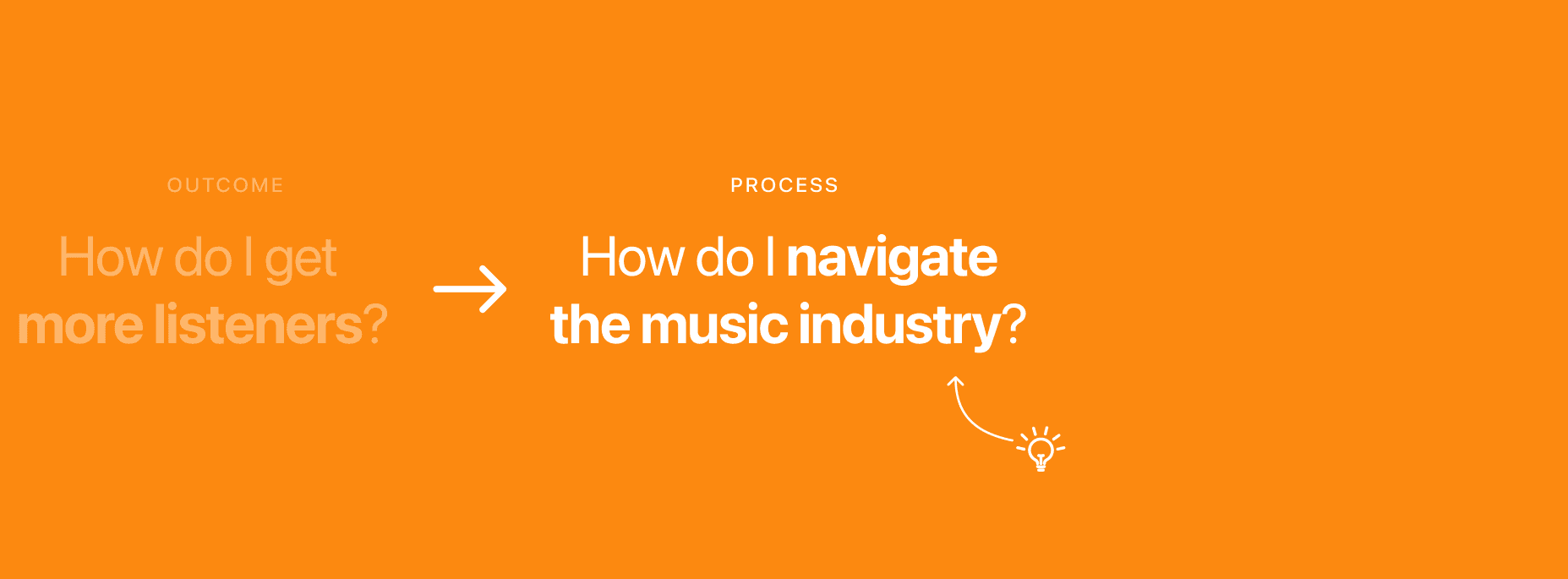
The insights I found through research marked a major shift in the product thinking moving forward.
What began as a visibility-focused exploration would now evolve into a more holistic outlook on the problem space where a digital solution could support musicians not just in being seen, but in career navigation and the work that goes into the backend of making, sharing and performing music.
How Might We Question
How might we empower emerging artists to strategically navigate the music industry and explore opportunities to accelerate their growth?
Phase 2 — Define
Persona
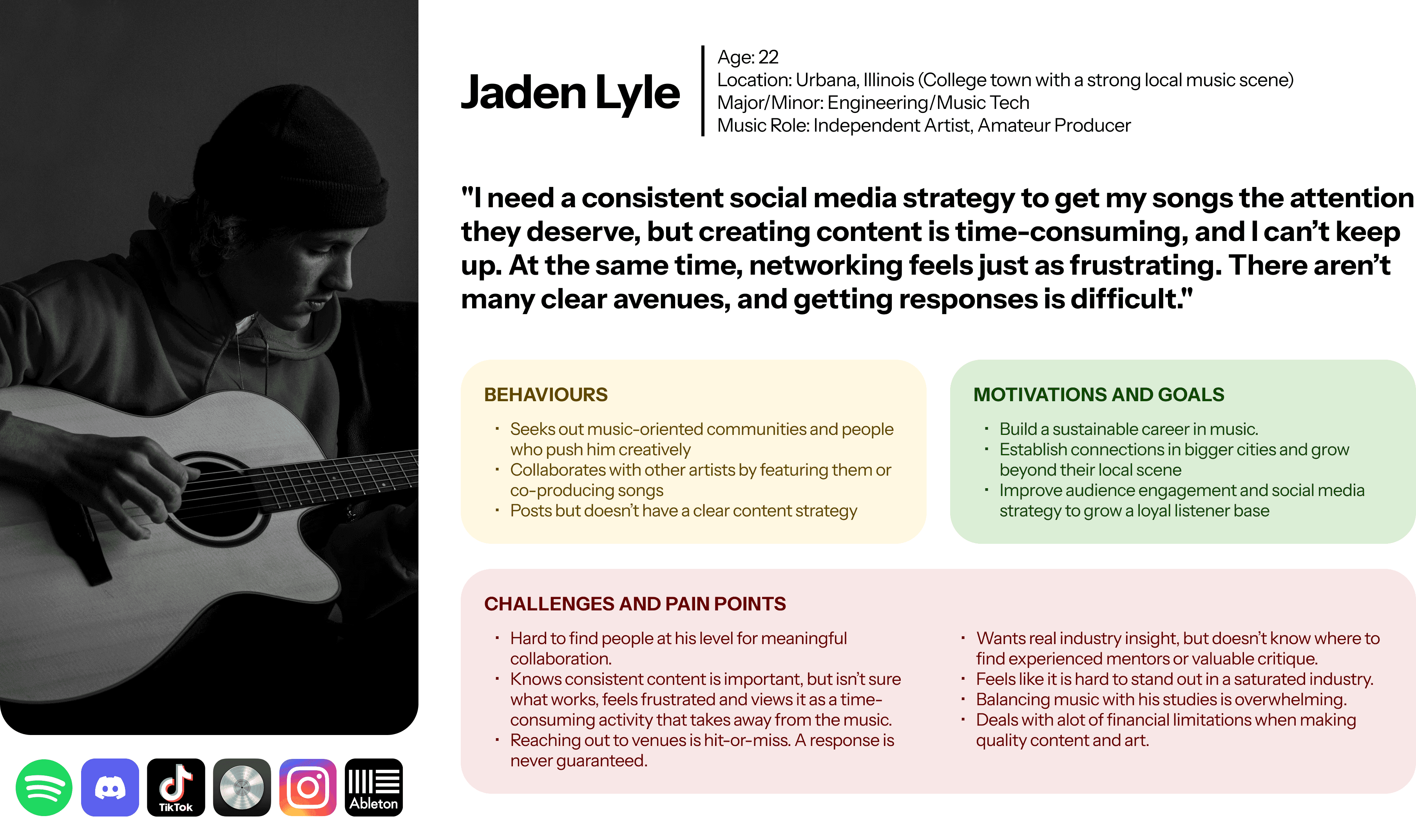
Introducing Jaden, the fictional, research-backed persona who represents the interviewees that I had conversations with.
Developing a clear artifact helped me visualize exactly who I was designing for and became a resource to come back to throughout the process.
Experience Mapping
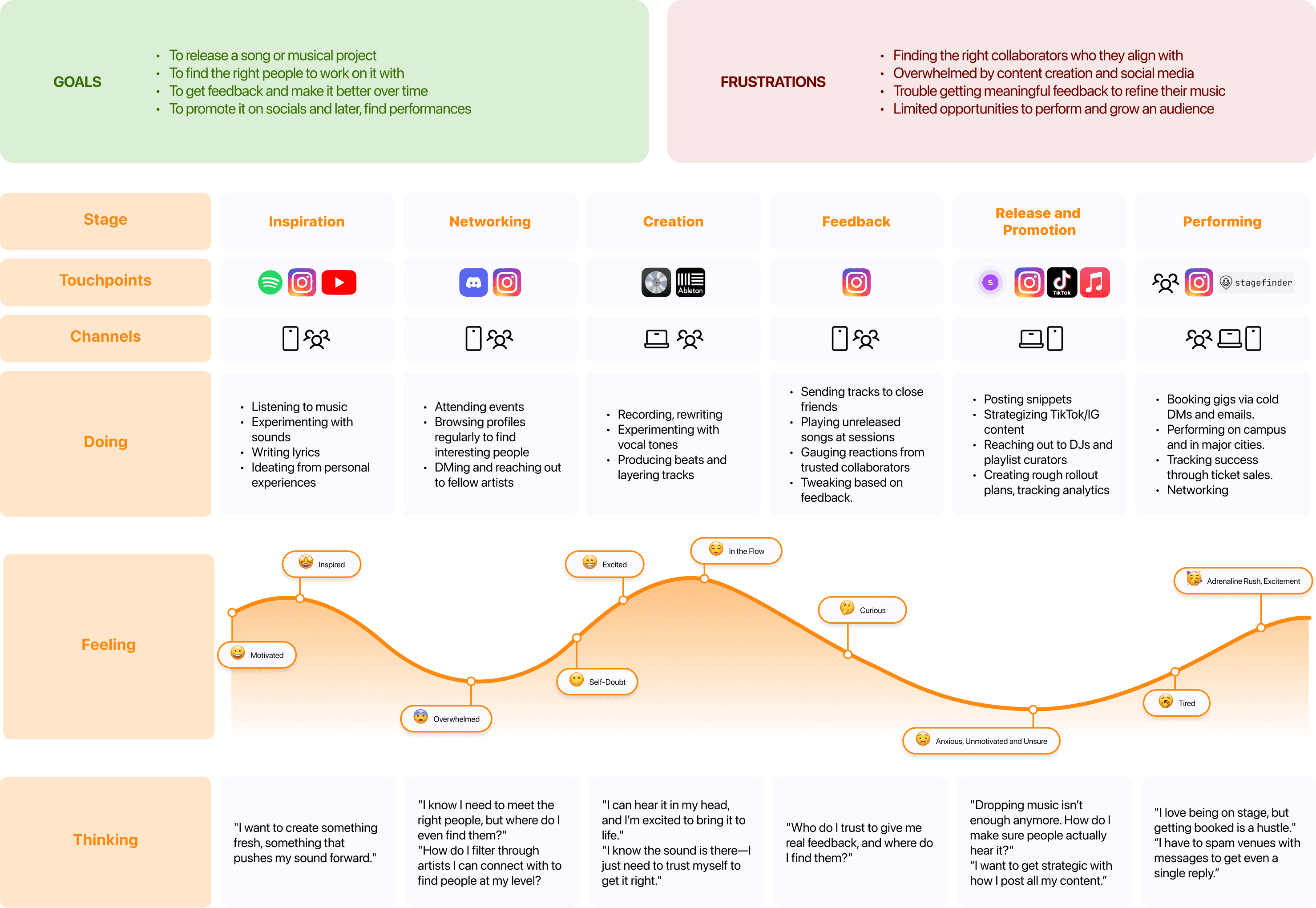
Creating an experience map helped me understand the exact journey that an artist goes through to release and promote music.
Having this laid out assisted in building the foundations of my knowledge of the problem space with a focus on the user. It also helped empathise with them better and identify areas for design intervention.
Task Flow Determination
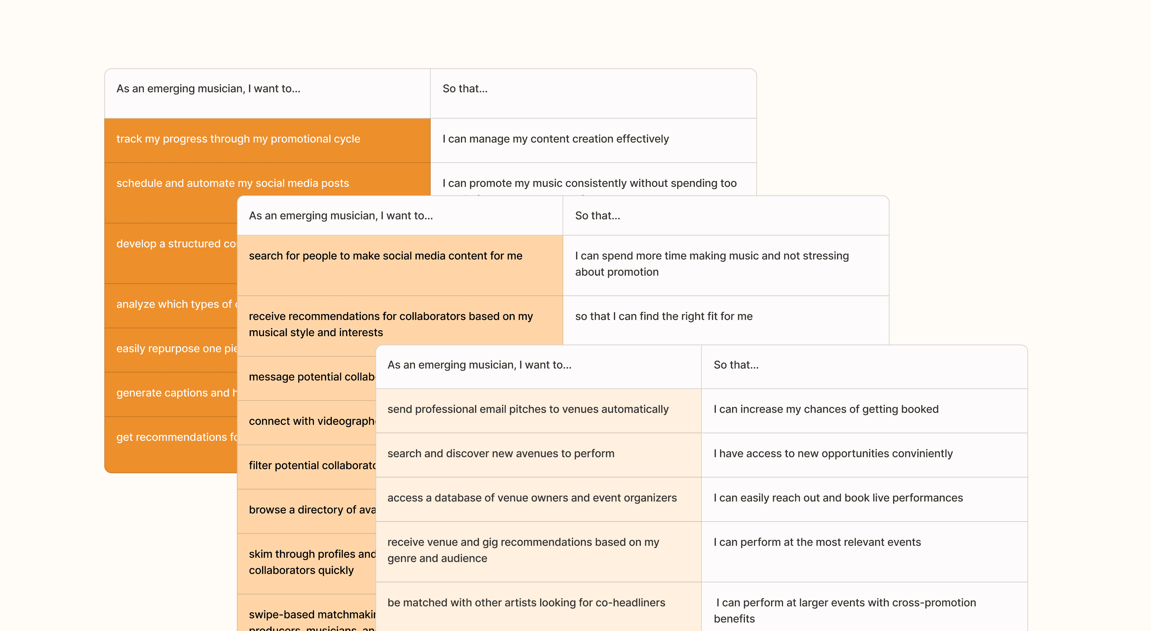
To ensure the platform addressed user needs and prioritized them, I translated user research insights into user stories. These helped me define functional requirements from the user’s perspective.
Once I had a set of user stories, I grouped them into epics that reflected key areas of the product. The three epics I picked were:
Finding Well-Matched Collaborators
Managing Online Presence and Promotion
Scheduling Performance Opportunities
Selecting Task Flows
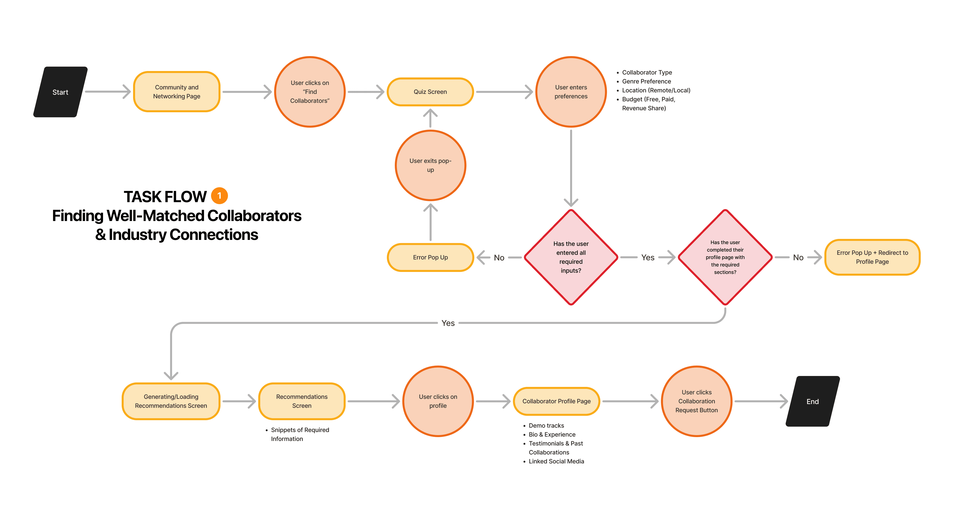
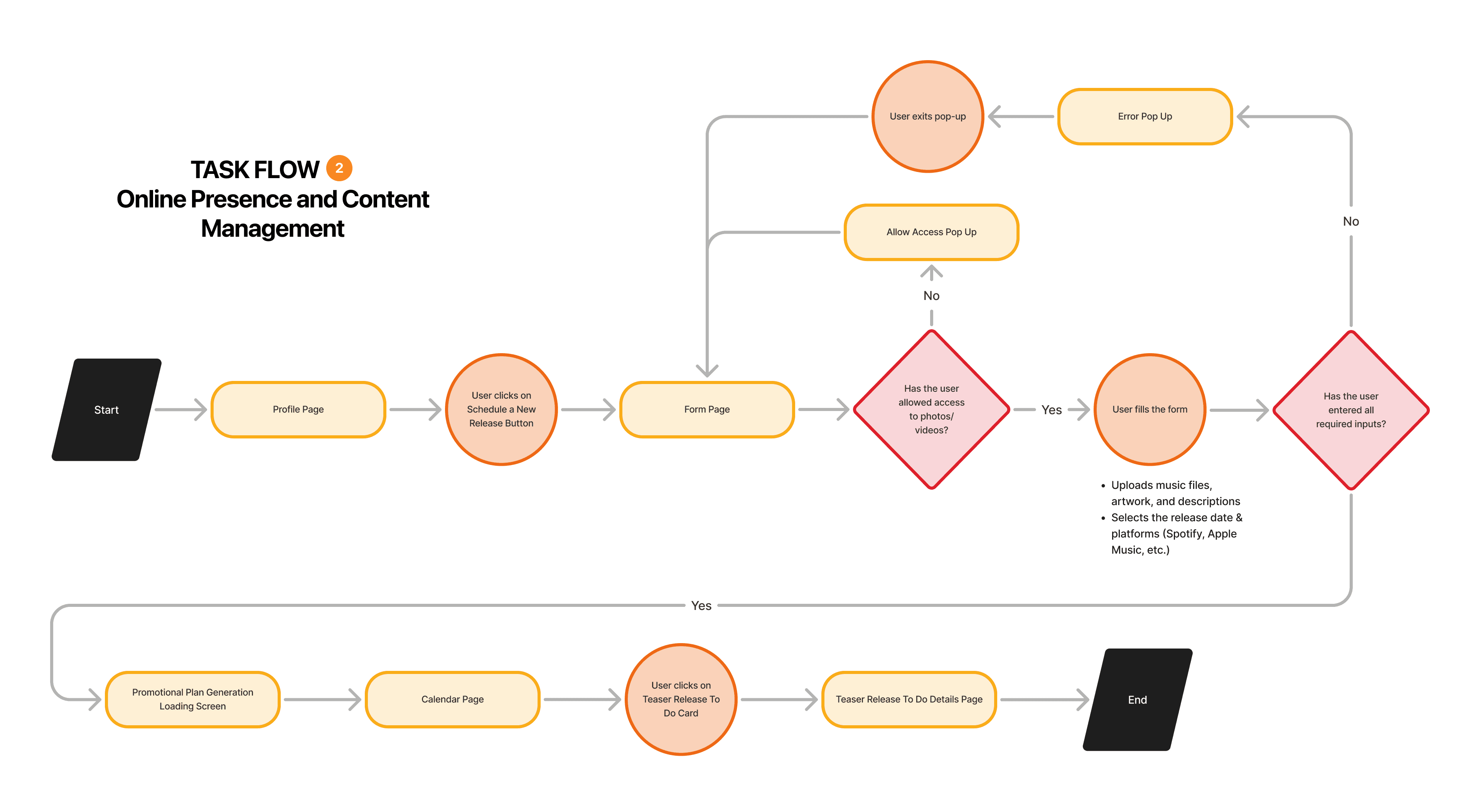
Having understood the main value my product would try to bring, I narrowed my focus down to the first two epics for the sake of time and scope of the project.
Instead, I decided to do a bit of concept testing on the last one during my user testing sessions and still consider the feature as a part of the application as organically as possible as if it were prototyped.
Finding Well-Matched Collaborators
Managing Online Presence and Promotion
Scheduling Performance Opportunities
Phase 3 — Design
Competitor Analysis
A competitor analysis revealed that there was a gap in the market for an artist-first career navigation platform.
While tools like Instagram and Fiverr were supportive of artists and main platforms for them to find an audience, collaborators and resources, they were too broad, didn’t cater to the music industry specifically and weren’t built for quick and efficient demo sharing. On the other hand, platforms like ReverbNation were too technical and focused mainly on marketing and analytics tools that felt tough to get a hand of.

A broad social platform artists use to build an audience and share content, but not built for music-specific networking, collaboration, or career tools.

An open marketplace for musicians and creatives to find paid work and collaborate, but lacks social engagement or promotional tools.
Helps musicians find gigs and promotes their work with marketing tools, but lacks networking or collaboration features.

A real-time collaboration tool with a built-in DAW and social engagement but limited gig-finding and promotional support.
A music-focused networking app for finding and connecting with collaborators, but centred on discovery and messaging without promotion or career-planning tools.
Initial Sketches
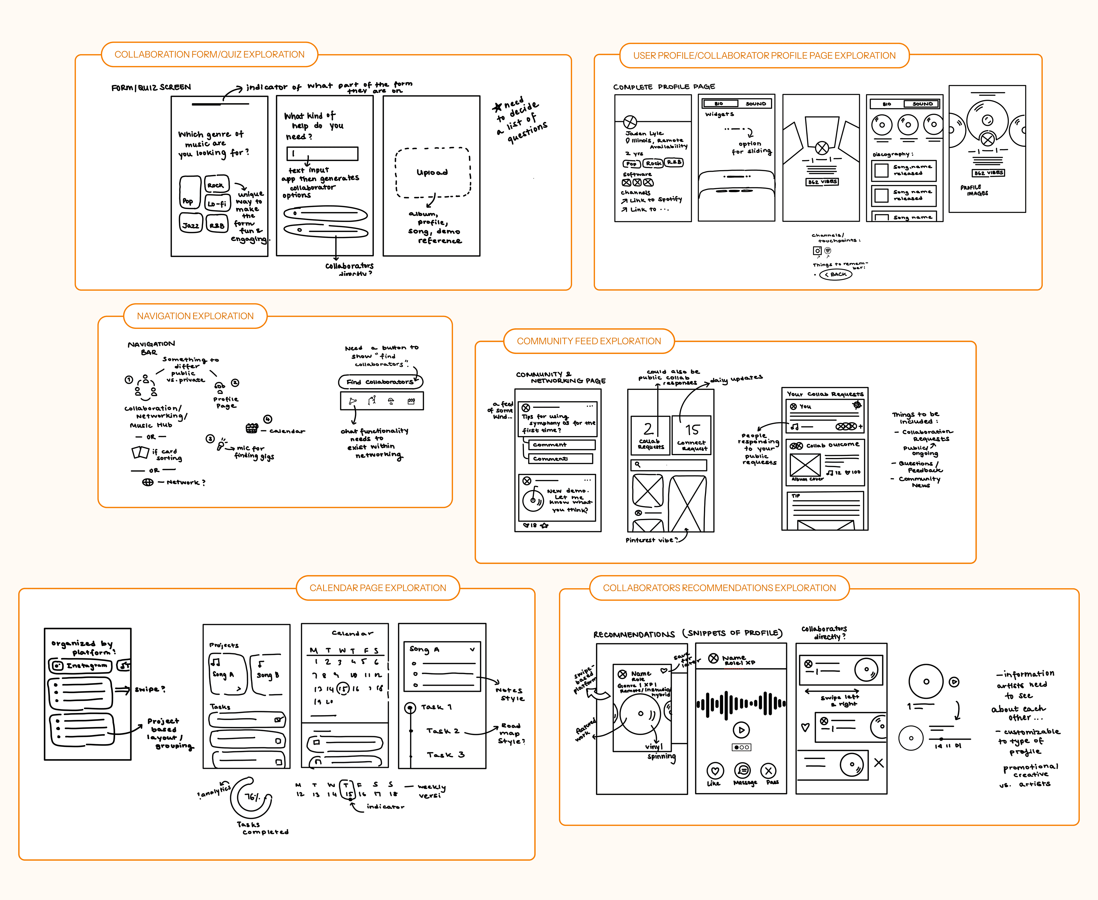
My main goal was to maintain a balance between existing mental models and traditional mobile app patterns while also making the experience feel just as unique, special and creative as my users.
I first explored existing mobile app patterns that employed similar interactions. I looked beyond the music space, drawing inspiration from:
Dating apps that matched users to one another
Scheduling and calendar-based components for the promotional planning screens
Onboarding flows of all kinds to get inspiration for the quiz screens to learn about the user
LinkedIn profiles to look at the way layouts were structured for high content volume
From there, I began sketching exploratory ideas. These evolved into solution sketches that helped me visualize how features would come together as final cohesive flows.
Wireframes and User Testing
After creating a mid-fidelity prototype based on my chosen sketches, I conducted usability testing with 10 users within my participant criteria to evaluate how intuitive the product appeared to them and whether it supported their existing workflows.
While users were able to complete core tasks without major friction, the sessions helped me uncover subconscious mental models that my users had, improve copy to align with music industry terminology, enhance feature functionality, and make the experience more tailored to how artists actually collaborate, plan, and promote in their day-to-day.
Home / Feed Page
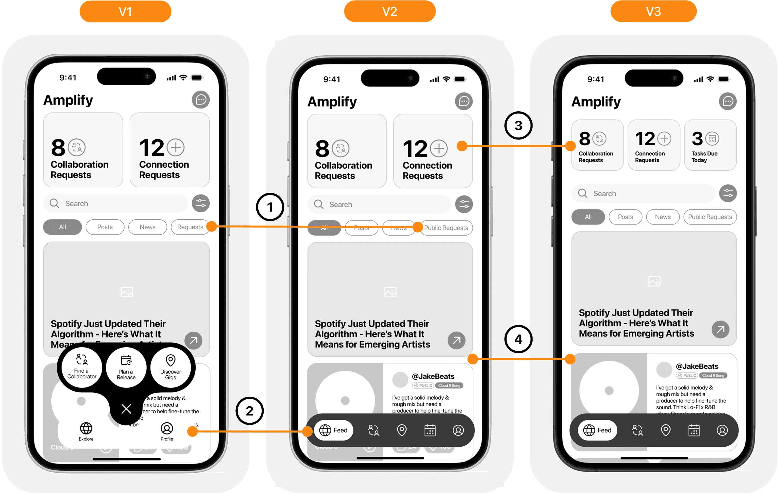
Version 2
Updated UX copy of filter names for better clarity.
Created an updated navigation bar — instead of being action-focused, more general and scalable.
Version 3
Added a third widget for tasks due daily as users felt they would check that the most often and use it as both a reminder and a shortcut.
Minute spacing adjustments between posts for readability.
Collaboration Task Flow Iterations
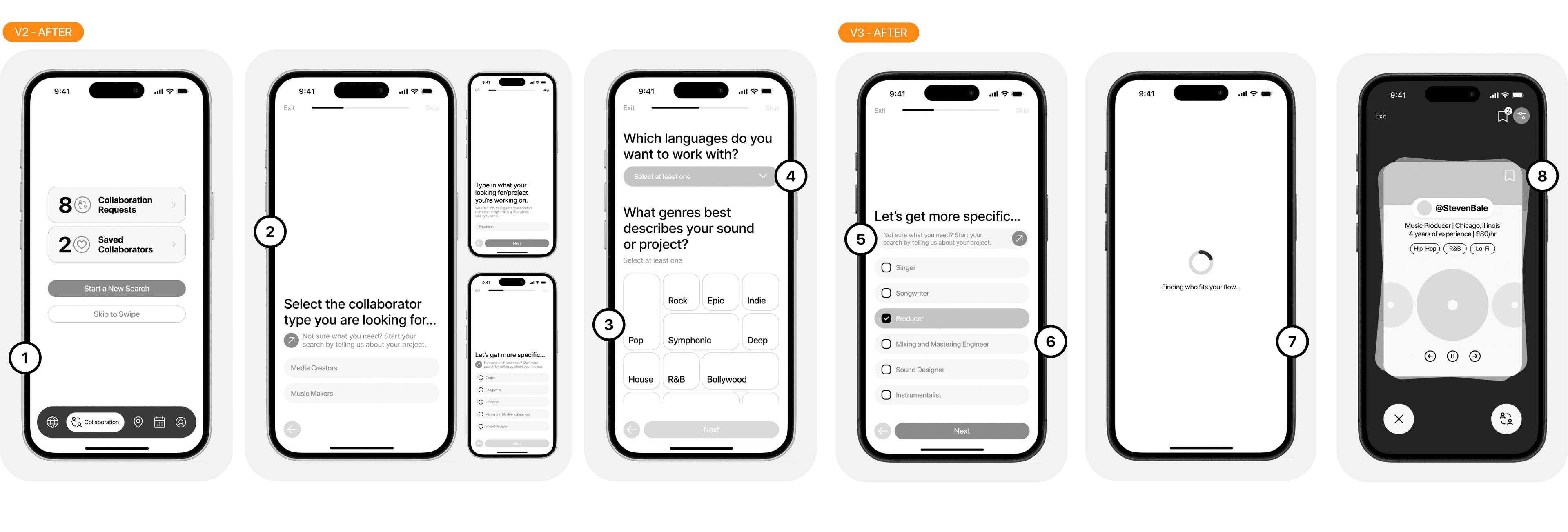
Version 2
Added a standard dashboard for the collaboration flow before the quiz.
Altered the order in which questions were presented in the form to better suit user preferences.
Added more genre options for better inclusivity.
Added more language options for better inclusivity.
Version 3
Changed button format for better recognizability.
Changed selection method to checkboxes with a less rounded edge to signify multiple selection clearly.
Added a loading screen to align with users' mental models and allow time for the system to generate recommendations.
Changed heart icon to bookmark icon to save collaborators, avoiding confusion between what was the primary versus secondary action on the screen.
Calendar Page

Version 2
Created an updated navigation bar — instead of being action-focused, more general and scalable.
Added categorization by project for better organization.
Added the ability to check off tasks as complete.
Version 3
A more concealed CTA for new releases to allow for more breathing room of the existing calendar.
Changed UX copy from ‘Projects’ to ‘Releases’ to align better with user expectations.
Added an information icon for data-driven context.
Reduced possible actions on task cards to avoid small tap targets.
Phase 4 — Branding
Brand Development
Having understood the main value my product would bring, its features and functionalities, I began thinking about the kind of brand I wanted to build around the platform.
Name Selection
The concept of amplification stuck with me. It came across as a clear metaphor associated with sound and music while also symbolizing growth, connection, and visibility.
From there, I locked onto Amplify but as I continued to use it, it felt predictable and lost in the sea of “-ify” startups. I chose AMP instead: bold, direct, and memorable. It captures the same spirit of elevating artists while giving the brand a stronger, more distinctive identity.
Colour Exploration
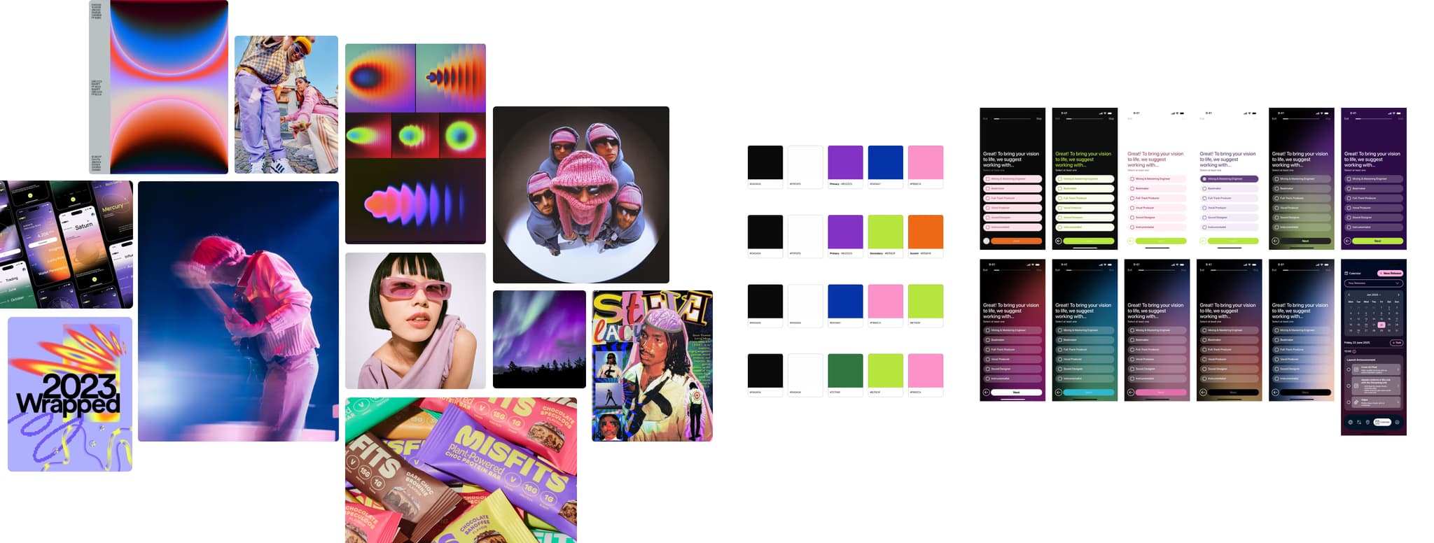
My initial vision for the application was inspired by funky, retrofuturistic music culture and bold LED-light colours that you’d find at a concert. But, after injecting the various colour schemes from the original exploration into the wireframes, I felt like the effect it had wasn’t what I intended.
This art direction once implemented was associated with astronomy or space or even a more sport-oriented aesthetic with the lime green.
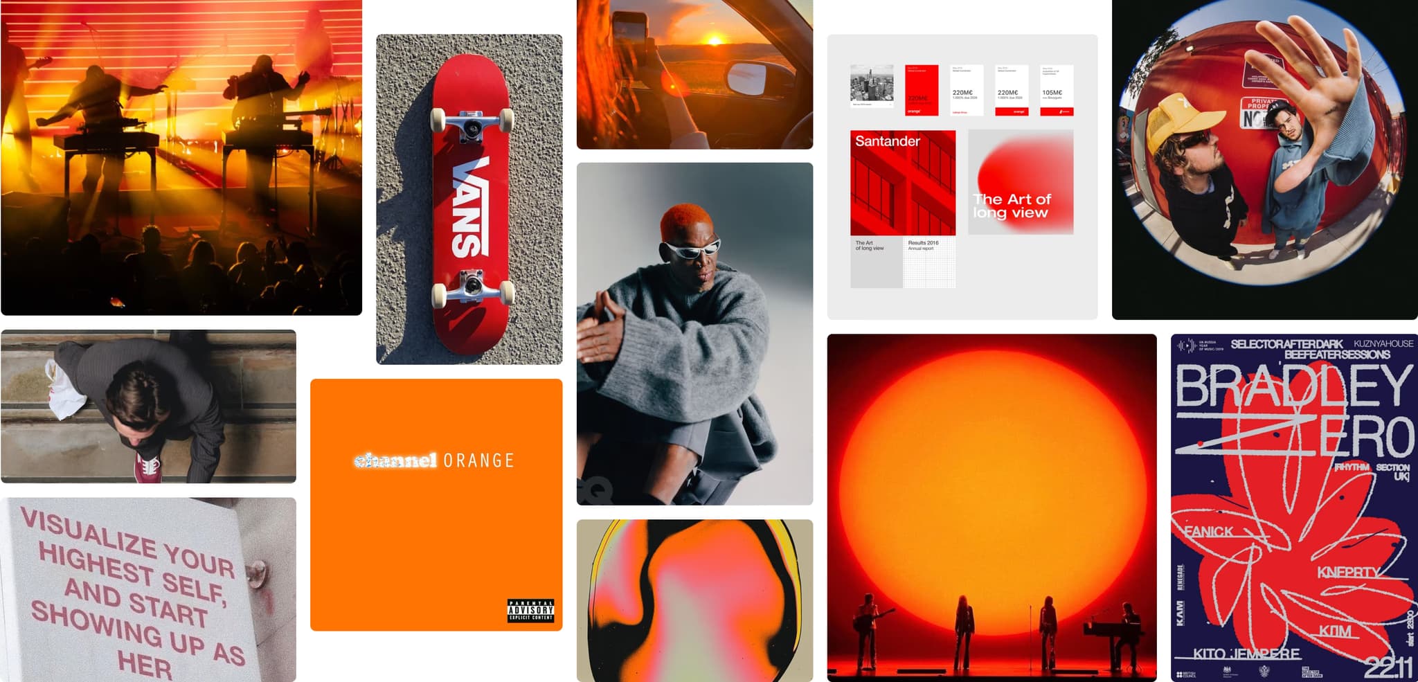
Refined Moodboard
So I went back to the drawing board and tried to pull back and simplify into a new vision for the brand that still represented the keywords I had in mind.
I focused on building a warmer palette, inspired by skater and music culture, what it means to be trendy and bold today.
Wordmark
The typeface I chose to express the wordmark is Tekno, sourced from Good Type Foundry.
Tekno is an extended display typeface with technologic features available in one weight/two styles. The extended width gives the text a stretched, rhythmic quality which can visually mimic beats or waveforms, creating a subconscious tie-in with music.
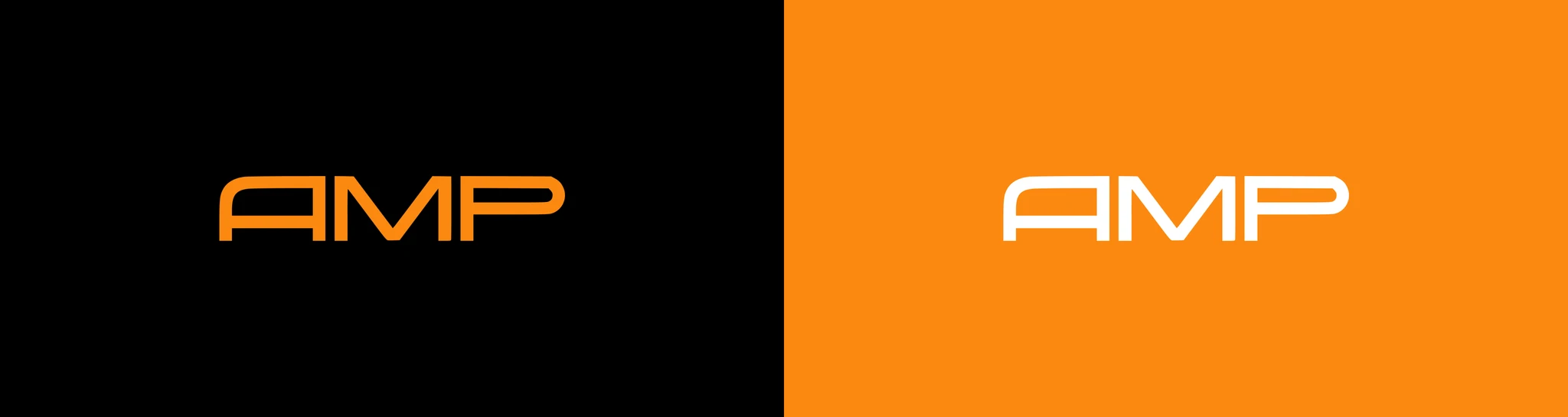
Logo Design
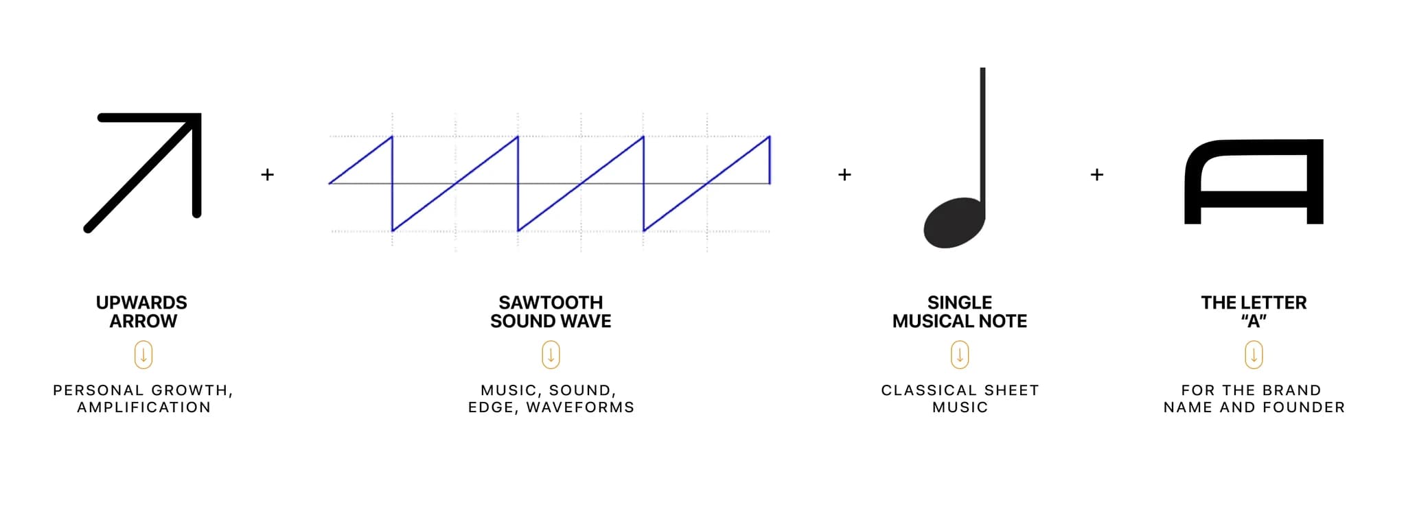
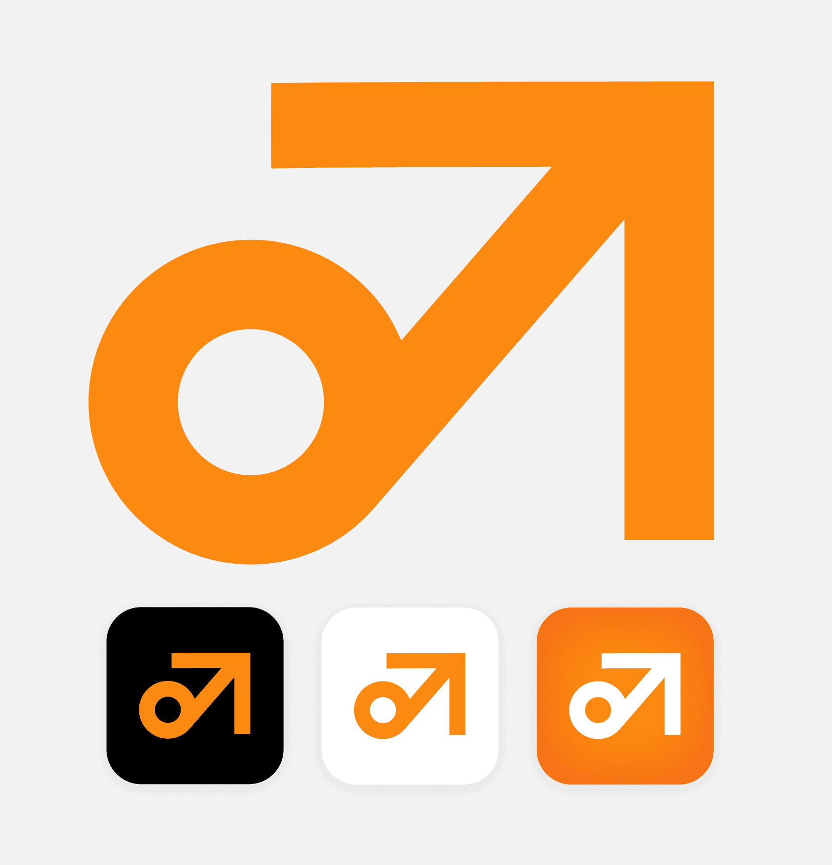
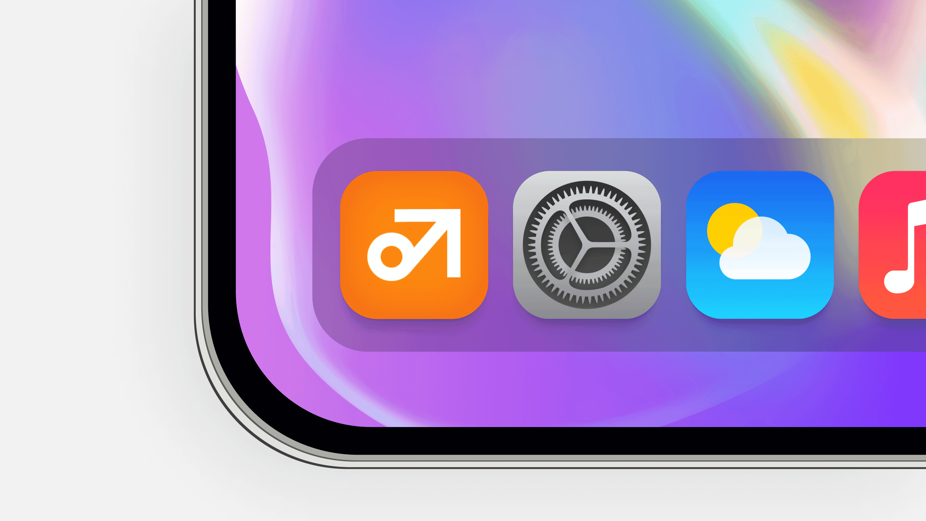
The logo was designed to reflect the core identity of the brand — forward-thinking, edgy and bold but still minimalist and professional.
The sharp angles and rounded nature of the form itself mimic the balance of these elements across the app and wordmark too.
UI Library
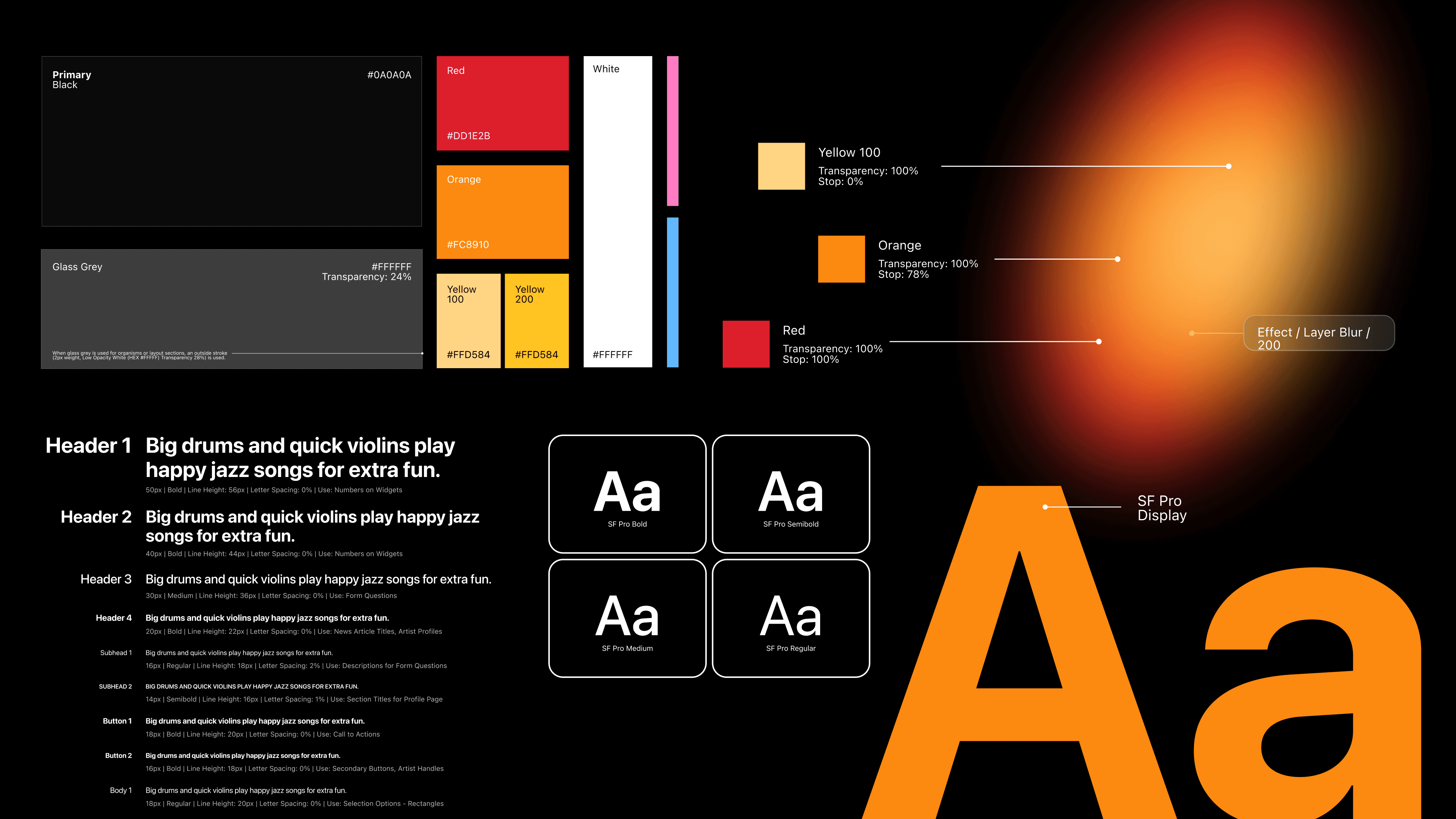
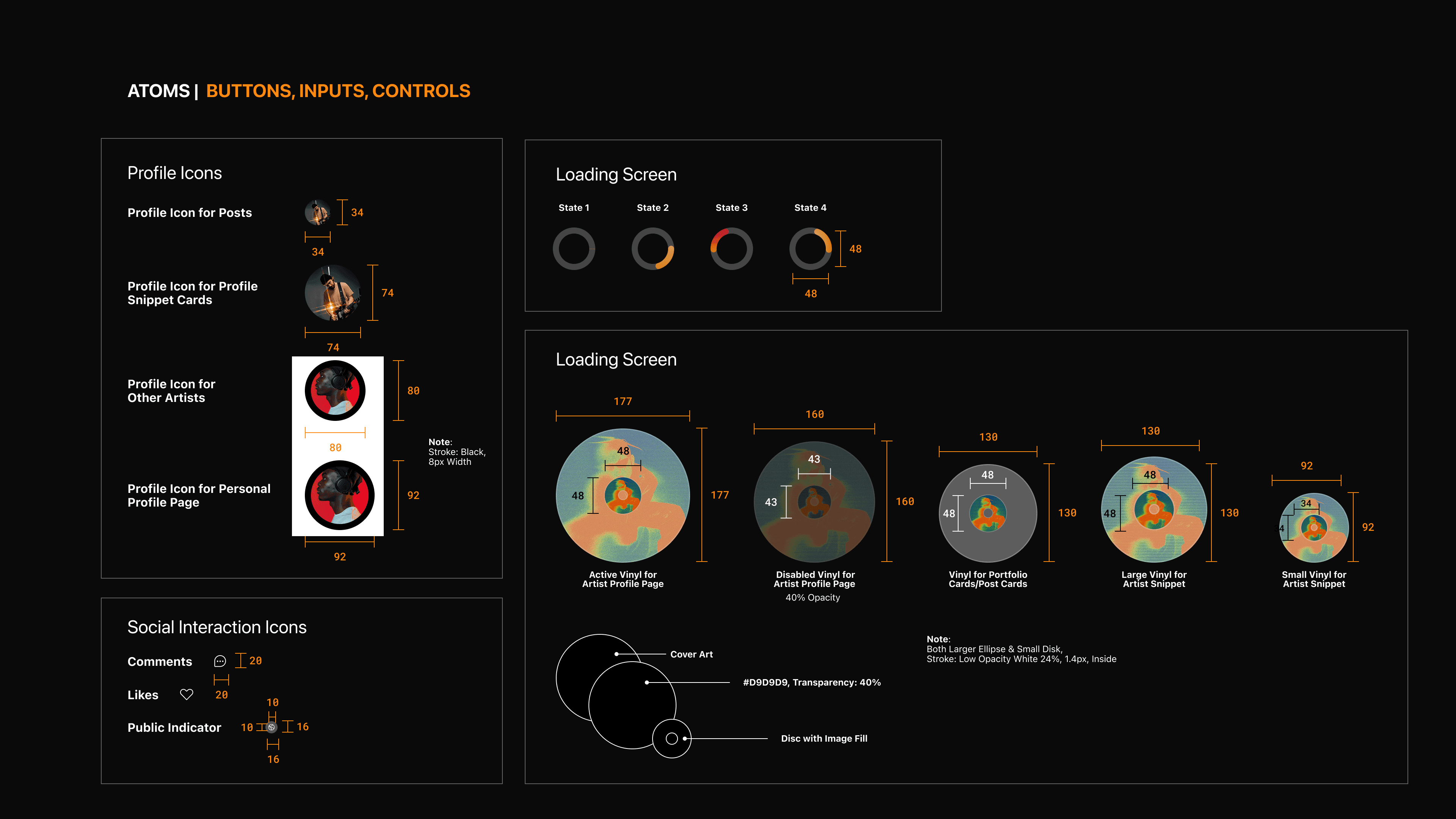
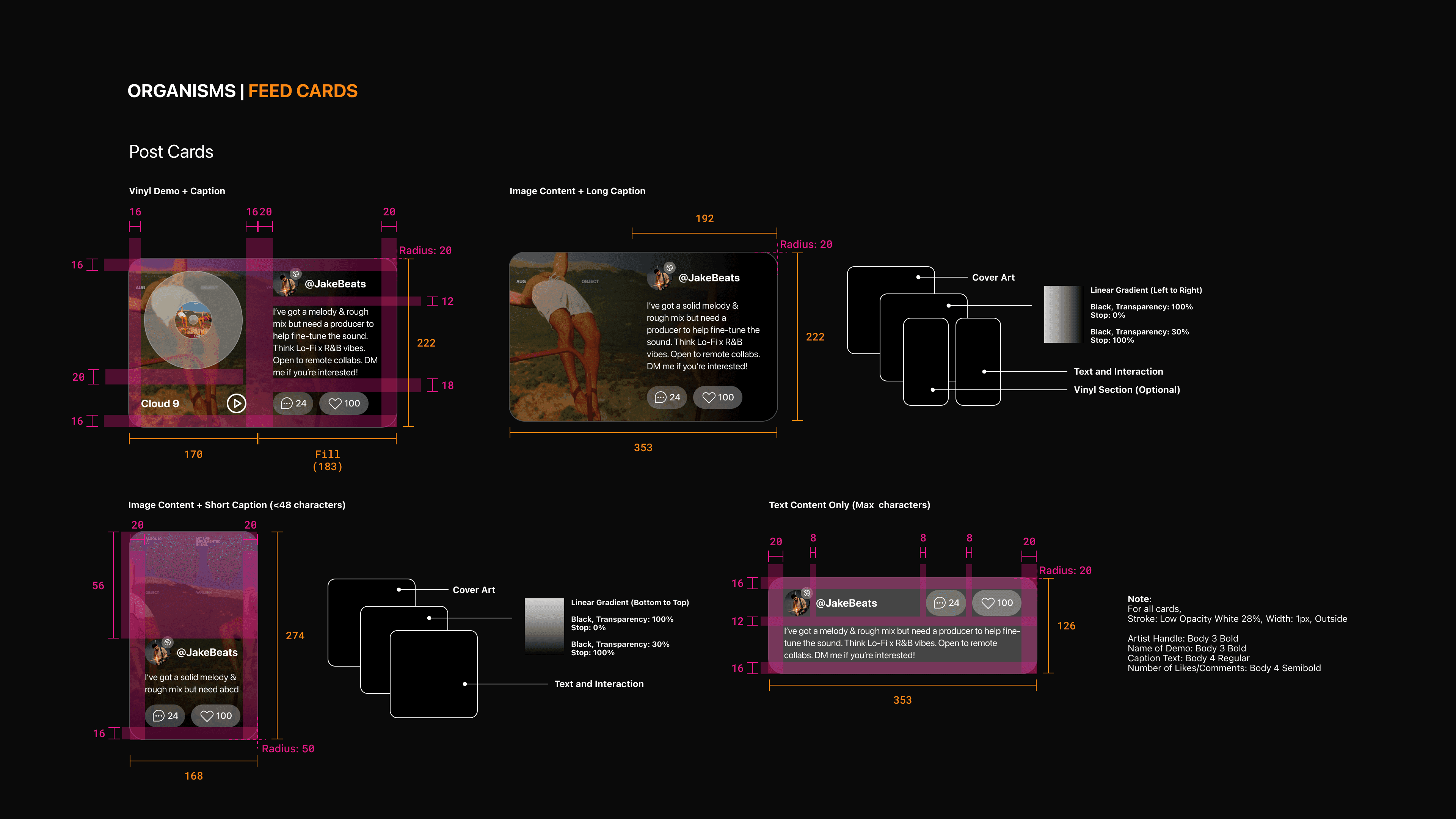
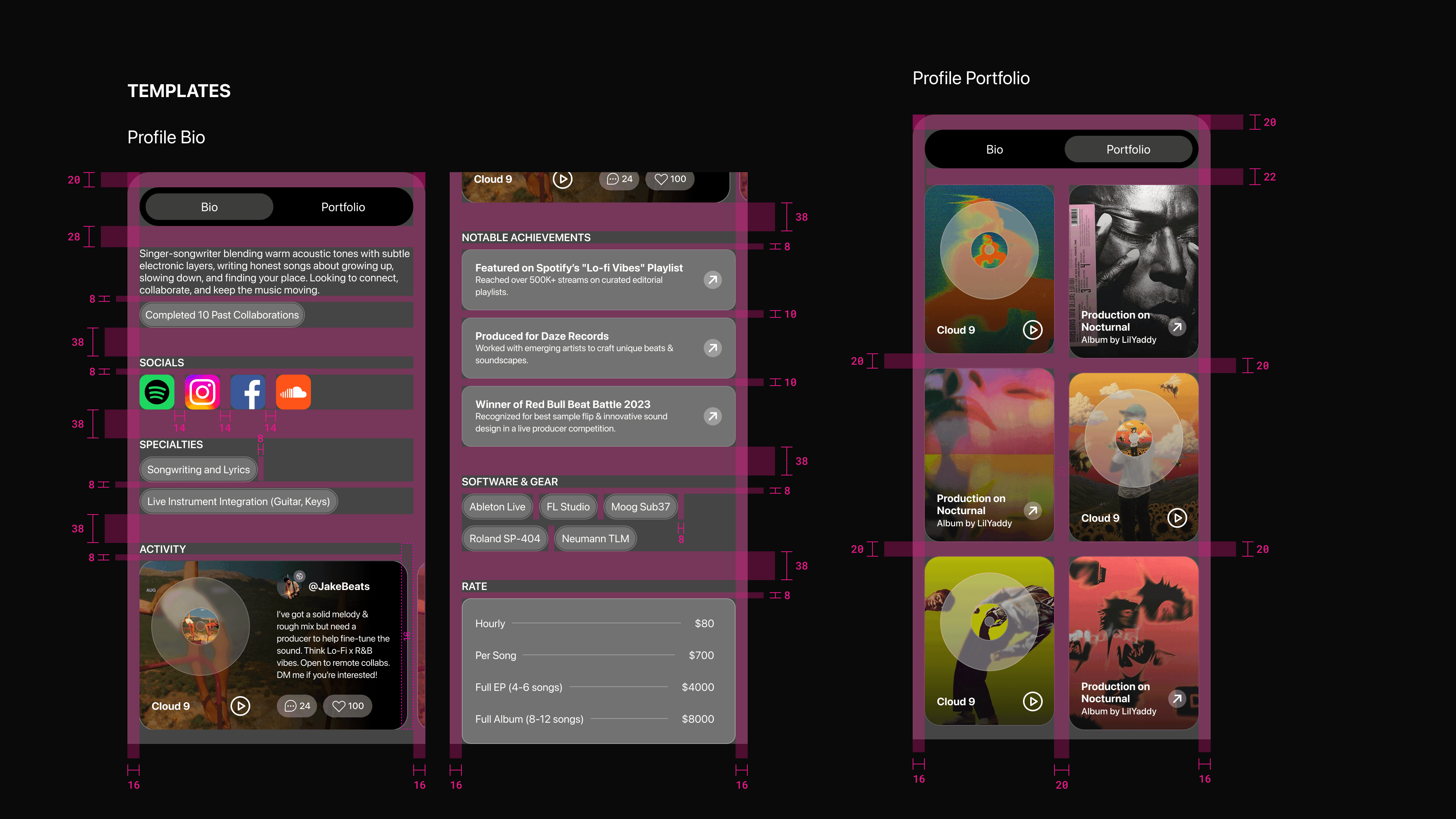
I used the Atomic Design Methodology to ensure consistency and scalability across the product.
This system made it easier to maintain visual cohesion, iterate quickly, and design with flexibility as new features were added. It also laid the groundwork for developer handoff and future design scaling.
Multi-Platform
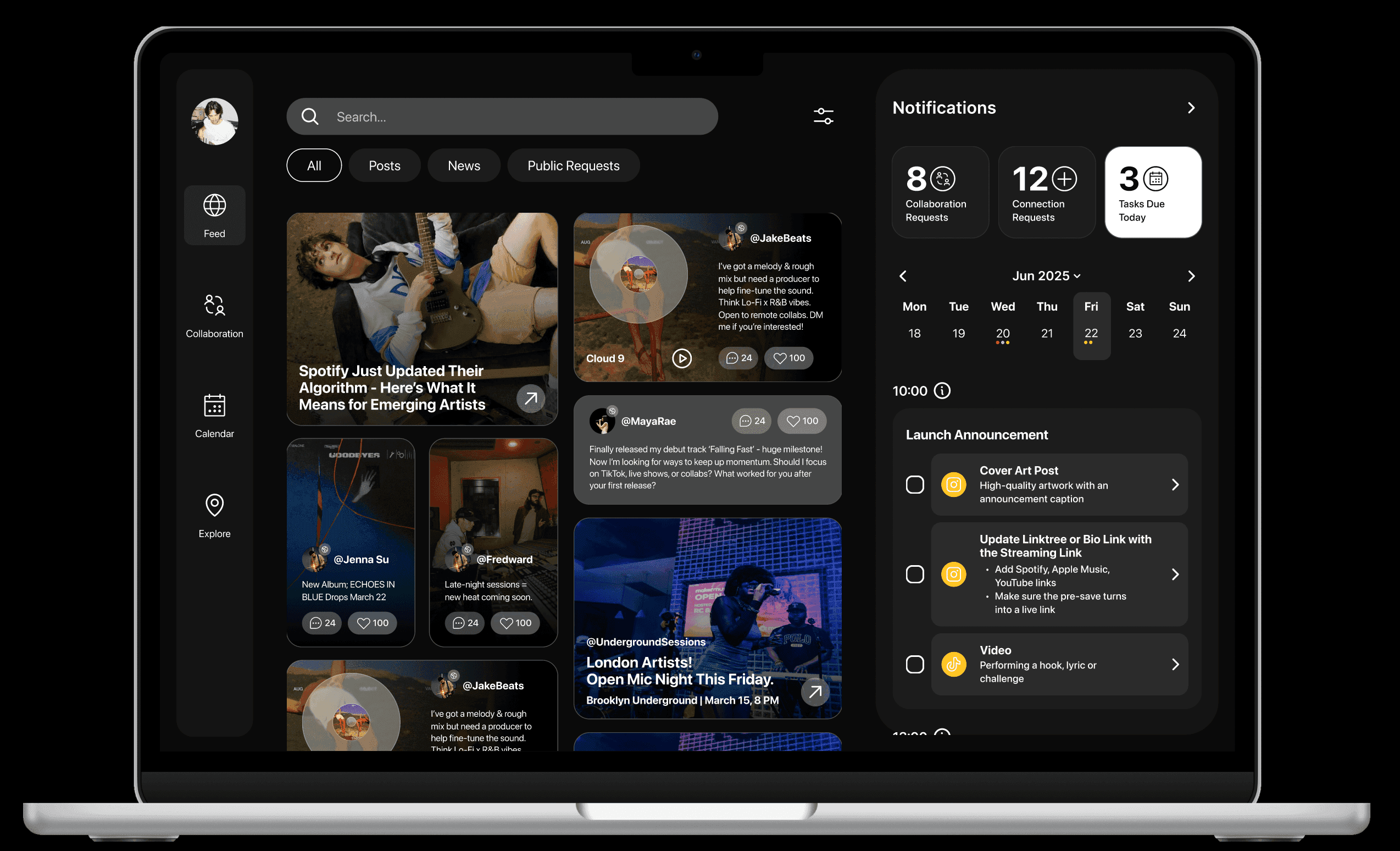
As I refined AMP, it became clear that while musicians rely on mobile for socials and discovery, many of their deeper career tasks are naturally done on a larger screen.
Designing a desktop app allows AMP to expand from a mobile companion to a comprehensive platform. A desktop version would support more robust task and calendar management and easier handling of media uploads, and planning.
Mobile Phones — for Social Media, Messaging, Voice Memos
Laptops — for Production, Business, Distribution, Zoom, DAWs
iPad — for Sketching Ideas, Live Shows, Lyric Writing
Marketing Website
To support the platform’s growth and build early trust with music industry creatives, I designed a product marketing page that clearly communicates the platform’s value.
The page highlights core features while using testimonials and visuals to build credibility. The goal was to make a strong first impression and create momentum around a product designed to help artists thrive.
What Users Said About the Platform
8/8 users that tested the product in high-fidelity said they would use this product regularly.
“It feels like my personal assistant.”
V, Singer/Songwriter
“This is so cool. I feel very seen.”
S, Singer/Songwriter
“Especially the promotion calendar feature, I'd save so much time if it worked the way you've designed.”
T, Singer/Songwriter
“You should totally make this.”
S, Producer
Key Takeaways
Designing for a system I haven't experienced before at all was hard - at first.
Branding can be deceiving sometimes.
Next Steps