Redesigning a Vibe-Coded Student-Life Application for @GirtonCollege
Role
Contract (Solo)
Tools
Figma, Cursor, Claude Code
Duration
1 Month
The Brief
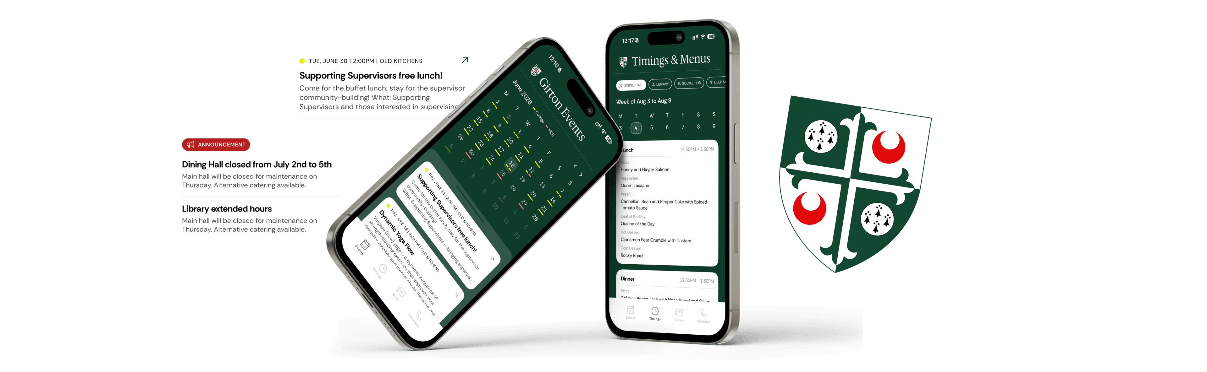
The old Girton College app was a student-built (“vibe-coded”) utility app serving undergraduate and postgraduate students — covering campus events, dining menus and timings, newsletters, and who-to-contact information.
It worked, but it had visual affordances that signalled it was vibecoded, there were a few usability issues, elements that didn’t match UX patterns, and it borrowed almost none of the College’s own visual identity.
How This Came Together
What started as a request for UX screens turned into me building the redesign myself, directly in their codebase.
Approached for UX Screens
A Tooling Gap Surfaced
Scope Shifted From Screens to Code
The Goal
A UI and branding revamp with a preppy, modern aesthetic — while keeping accessibility — and one strategic constraint underneath it: the system needed to be scalable and customisable across multiple colleges, not a one-off skin for Girton alone.
Method — Heuristic Evaluation
Before touching the redesign, I ran a heuristic evaluation of the legacy app against Nielsen’s 10 heuristics, using severity ratings (0–4) to prioritise what to fix first.
Screens evaluated: Event detail modal, Events calendar, Timings & Menus, Dining Hall Menu, News. The findings below are organised screen by screen, with the relevant heuristics and the redesign decision that addresses each.
Screen — Events Calendar
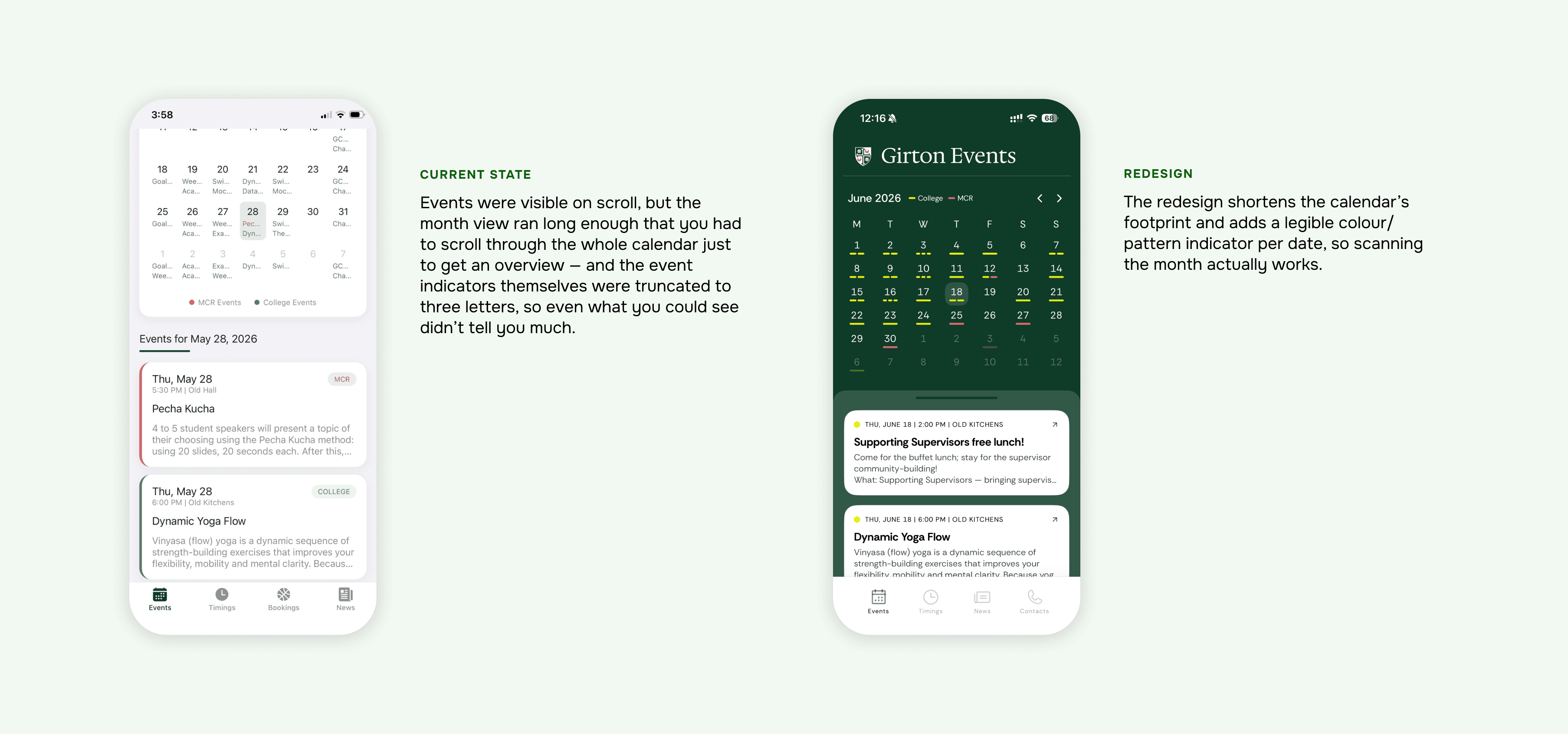
Heuristic 6 — Recognition Rather Than Recall
The calendar was too long to scan, and its indicators were too truncated to read.
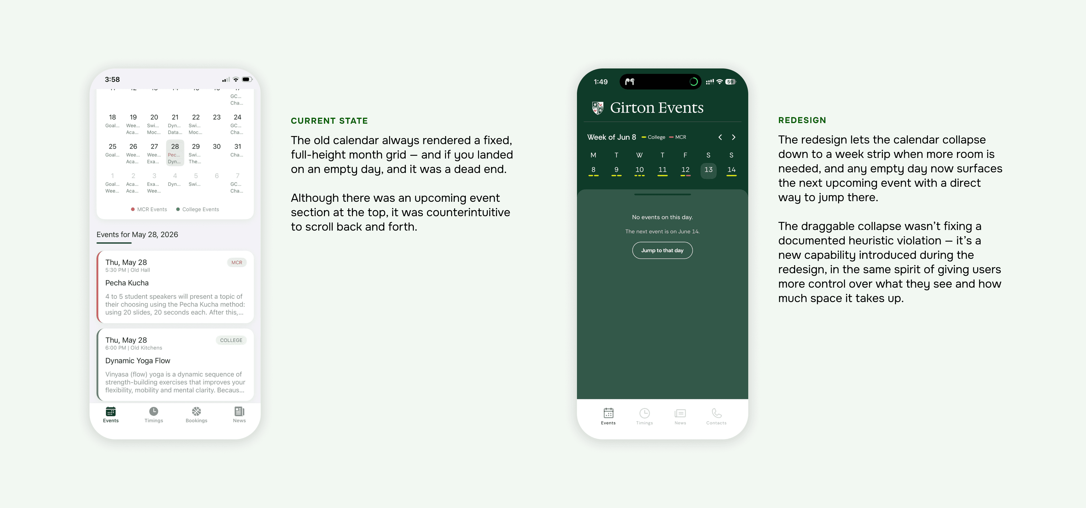
Heuristics 7 & 9 — Flexibility of Use · Recover From a Dead End
A full month grid was the only view — and an empty day had nowhere to go.
Screen — Header / Branding
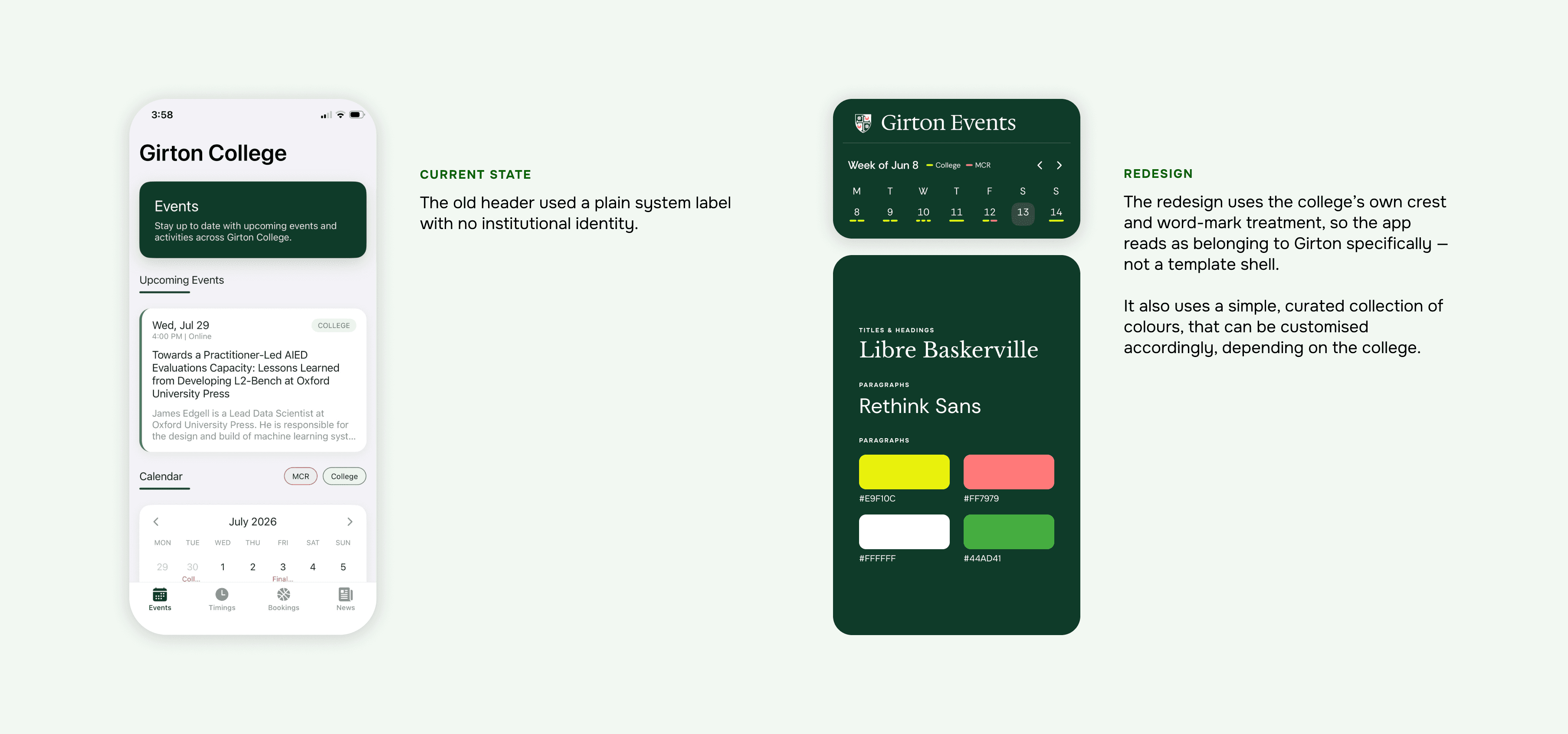
Heuristic 2 — Match Between System and the Real World
A generic header, on an app for a 155-year-old college.
Screen — Dining Hall (Menu / Timings)
Heuristics 3 & 4 — User Control · Consistency
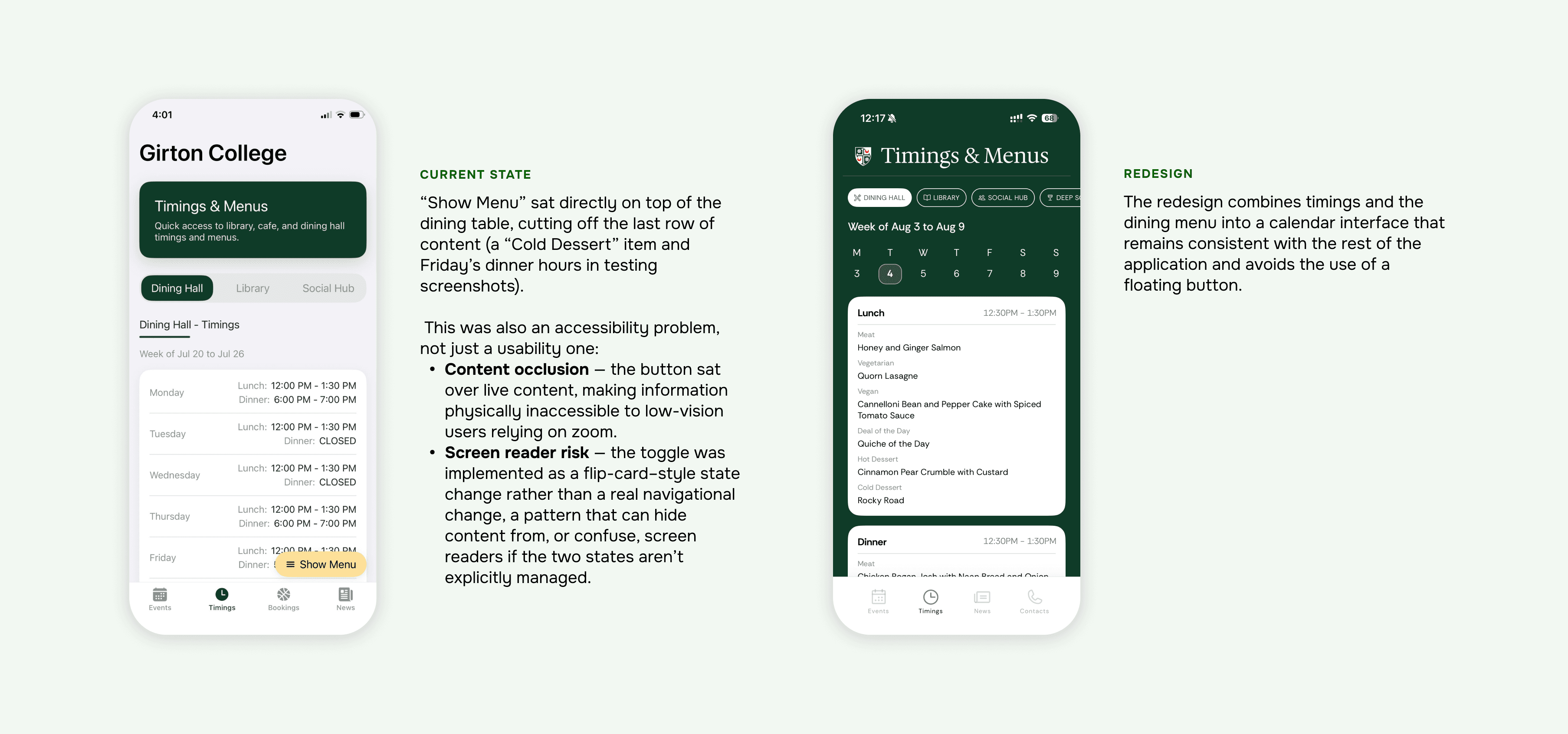
A floating button was the only way to switch views — and it hid the answer.
Heuristic 1 — Visibility of System Status
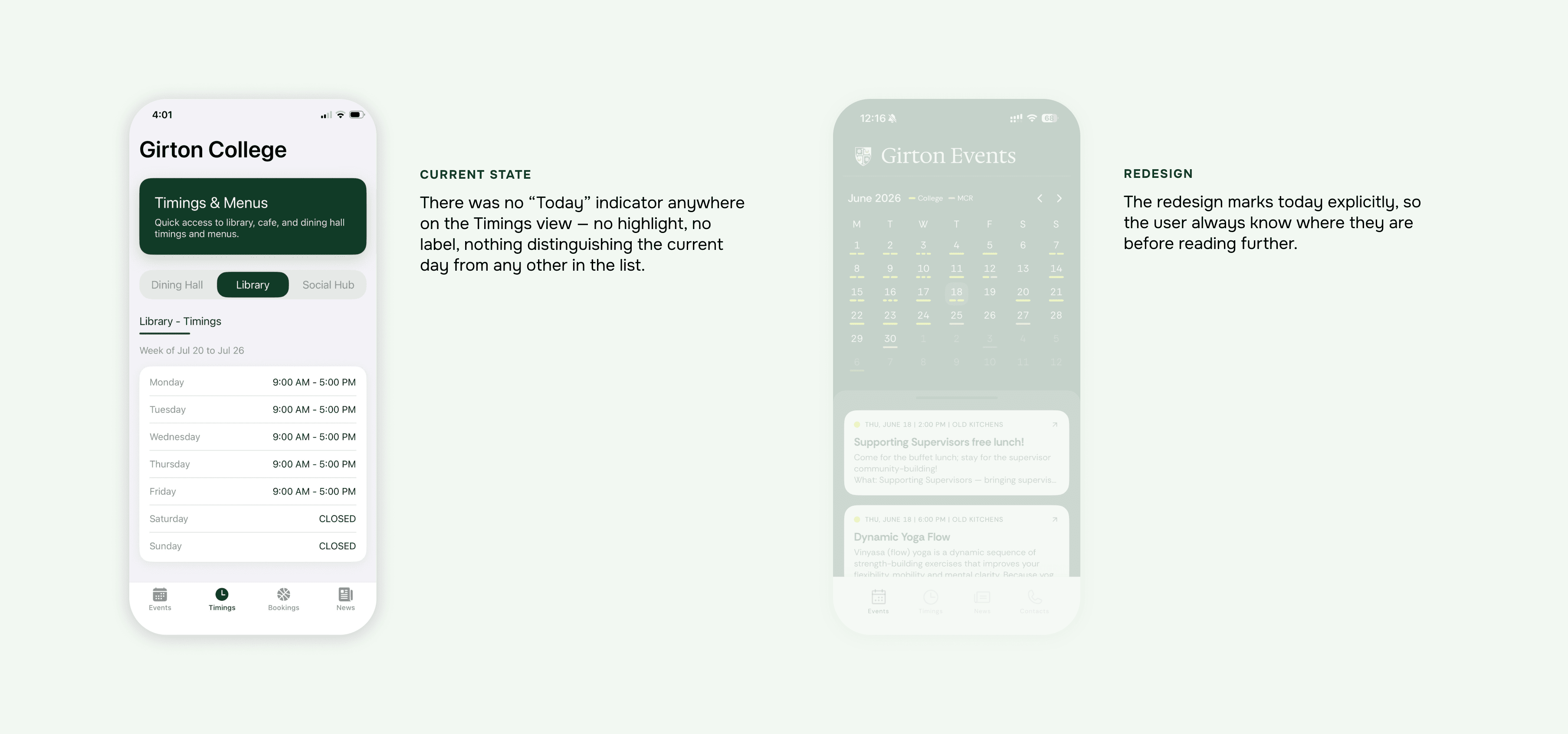
The Timings page never told you which day you were looking at.
Screen — Event Detail
Heuristics 3 & 8 — User Control · Minimalist Design
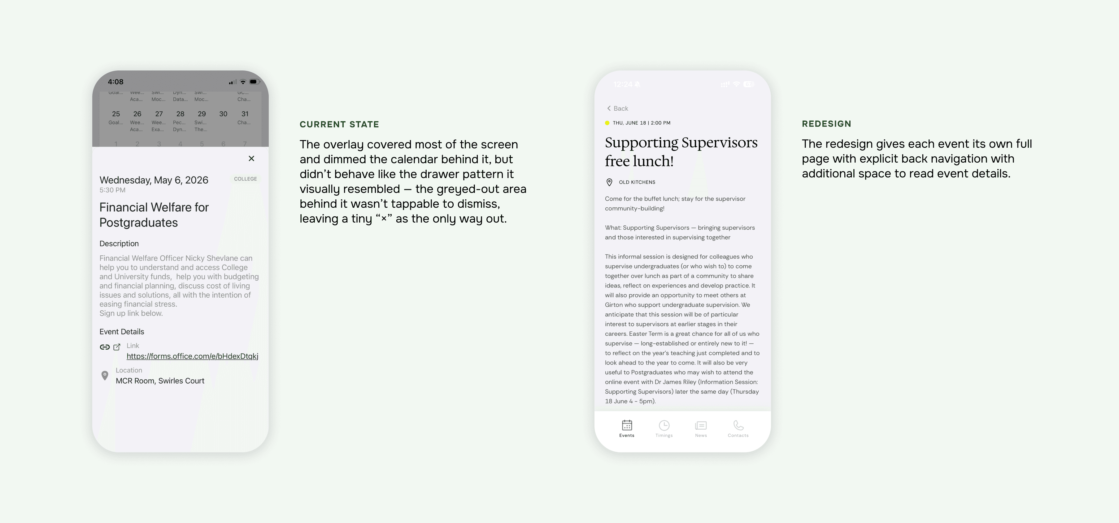
Event details lived in a 3/4-height sheet, working like a drawer without a drawer’s affordances.
Screen — Bookings → Contacts
Heuristic 1 — Visibility of System Status
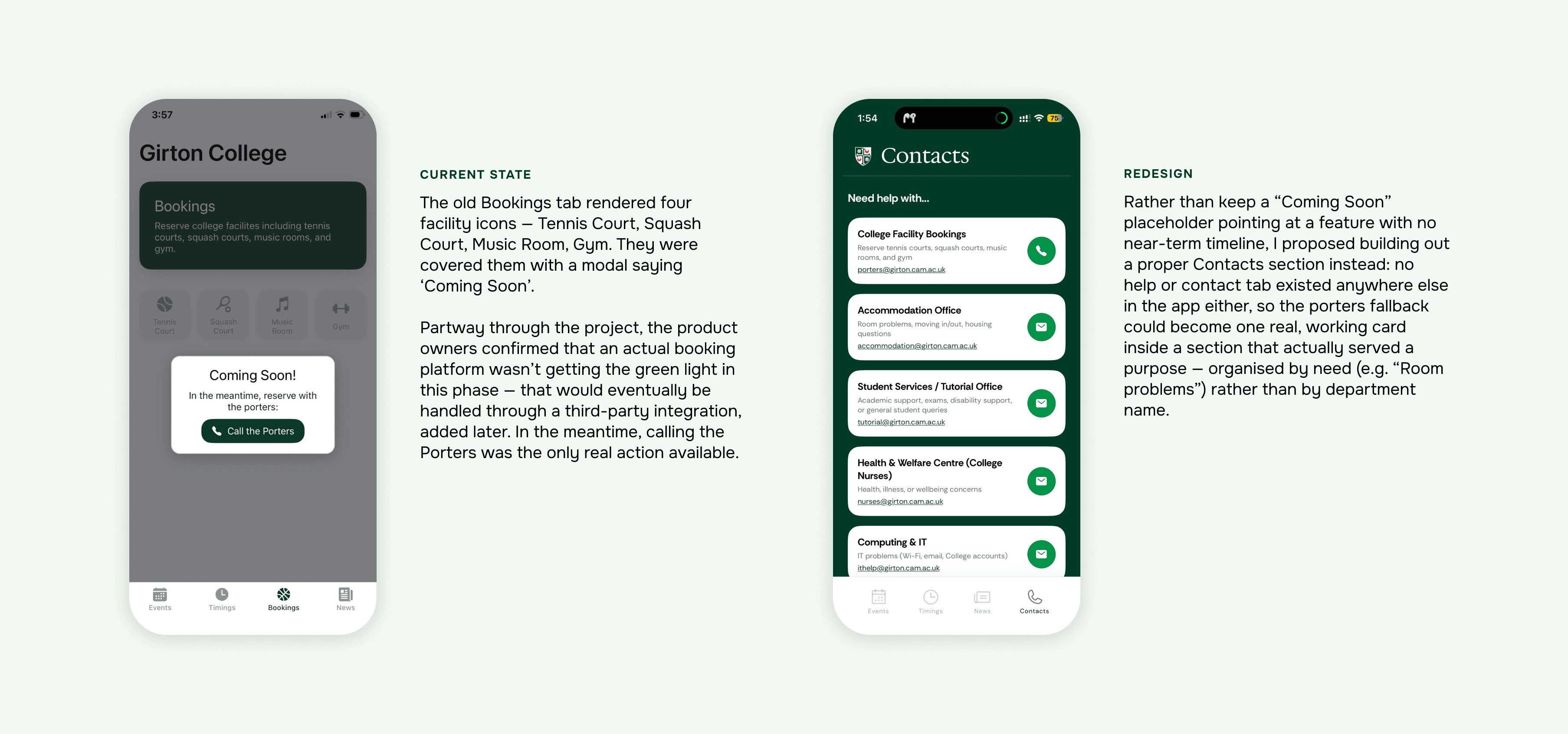
A tab of tappable-looking icons, immediately blocked by “Coming Soon.”
Scalability
Beyond the Girton-specific fixes, the system was designed so the same components, branding tokens, and interaction patterns could be reconfigured for other colleges — not a bespoke reskin, but a base to customise from.
Outcome / Status
The old version is currently live. The redesign is in TestFlight now, targeting launch before the 2026–2027 academic year.
Key Takeaways
This was a smaller-scope project than FAB or AMP, but it did two things neither of those did.
It was my first hands-on experience actually working with AI-assisted/vibecoding tools as part of a live design workflow (not just as a design subject), and it doubled as a real test of publishing an app to the Apple App Store — going through App Store review, TestFlight, and everything that process actually involves, rather than just designing the screens and handing off.